5 Landing Page Tips Every Business Should Use

You’ve paid for the click. Now your landing page has to do the heavy lifting. Whether it’s running Google Ads, LinkedIn campaigns or email funnels. Your landing page is where interest either turns into action—or disappears.
Too often, businesses throw together a half-baked page and wonder why it doesn’t convert. It’s not the traffic. It’s the page.
Landing pages are not homepages. They’re not blog posts or About pages either. They’re built for a single purpose: conversion. Yet most businesses treat them like just another part of the website.
They clutter the page with extra links. Add fluffy copy that doesn’t lead anywhere. Include a menu bar “just in case” the visitor wants to explore.
Spoiler: they don’t. If someone clicked your ad, they want a solution—not your company’s backstory or vision statement.
A strong landing page removes friction. It makes the next step obvious, fast, and painless.
Let’s talk about what really makes landing pages work and why most miss the mark.
We will also give you our top 5 landing page tips.
It’s About Momentum
When someone lands on your page, they’re already in motion. Your job is to keep them moving in the right direction.
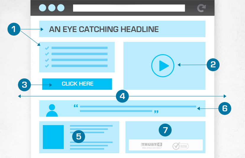
The headline pulls them in. The subhead confirms they’re in the right place. The content answers objections. The form or CTA button lets them act.
At every point, you’re either adding speed – or creating drag.
Here’s what slows people down:
- Long blocks of text
- Vague headlines
- Slow-loading images
- Conflicting messages or CTAs
- Desktop-only layouts that break on mobile
And the landing page tip to keeps momentum:
- One message, clearly stated
- Clean layout and spacing
- Obvious benefit-focused headlines
- One goal, one action
- Fast load speeds on any device
Landing pages are like salespeople. The best ones don’t distract or explain too much. They listen, respond, and close.
Don’t Let Design Get in the Way
Design matters – but only when it supports the message.
Landing page tip: That sleek animation? If it delays your load time, it’s killing conversions. The full-width video background? Cool – but is it necessary? Landing pages aren’t where you show off. It’s where you convert.
Form follows function. The layout should support the CTA. The design should guide the eye. Anything else is noise.
Great design doesn’t look clever. It looks invisible.
Mobile Isn’t Optional – It’s the Priority
More than 70% of landing page traffic comes from mobile. Yet most pages are designed on desktops and tested later. That’s backwards.
Mobile users are impatient. They tap, skim and bounce if things don’t work. You’ve got seconds to make the page feel trustworthy, fast, and easy.
- Here’s the mobile-first checklist:
- Is the CTA visible without scrolling?
- Is the form tappable and short?
- Do images load fast on 4G?
- Is text readable without zooming?
If not, you’re losing money. It’s that simple.
People Scan, Not Read
Your landing page is not a brochure. It’s a response mechanism. Treat it like a conversation, not a pitch.
Use short paragraphs. Clear subheadings. Bullet points (sparingly). And speak like a human.
Most importantly – write for outcomes, not features. People don’t care about what you do. They care about what it gets them.
Bad: “We deliver integrated digital marketing solutions.” Better: “Get more leads without wasting your ad budget.”
You’re not selling a service. You’re selling the result.
Every Element Has a Job
The headline pulls them in. The subhead reassures them. The hero image builds trust. The copy handles objections. The CTA shows the next step.
If any of those parts are weak, the whole machine underperforms.
Don’t leave them to chance. Don’t overthink it either. Use the language your customers already use when they talk about their problems—and what they want fixed.
You can also use tools like Hotjar to see where users hesitate, scroll, or click—so you know what to improve.
Now that we’ve covered what actually makes landing pages convert, here are five landing page tips you can implement straight away:
5 Landing Page Tips That Actually Work
1. Cut the Bloat. Clarity Converts.
If you confuse, you lose. People aren’t reading—they’re scanning. That means your message needs to land in five seconds or less.
Use short, direct headlines. Break your text into small chunks. Lead with outcomes, not waffle.
Bad: “We offer integrated digital solutions to elevate your brand.” Good: “Get more leads from your website—fast.”
2. One Page. One Job.
This is the most common mistake. You’ve got a call to action, then another one. A button that says “Call now” next to a form that says “Download the guide.”
Pick one goal. One CTA. Repeat it clearly and consistently.
Landing pages with a single call to action convert 2–3 times better than those with multiple. That’s not a guess—that’s backed by industry data.
3. Design for Mobile First—Not Mobile Also
80% of your traffic is mobile. So why are you still designing for desktop?
Here’s what mobile-first really means:
- Clean, single-column layout
- Big, tappable buttons
- Lightning-fast load speed
Your form should be short and dead easy to complete. And test it on actual phones—not just your desktop preview.
4. Use Real Images That Build Trust
Stock photos are obvious. And they kill trust.
Instead, use images that support your message. Show real customers, your actual product, or before-and-after results.
Better still—use a short video. Pages with video can boost conversions by 80% or more. Just keep it under 60 seconds, and make sure it loads fast.
5. Create More Than One
Most businesses have one landing page and hope it works for everything. It won’t.
You should have different landing pages for different audiences, campaigns, and goals.
Examples:
- One for your SEO campaign
- One for LinkedIn ads targeting B2B clients
- One for a time-limited promo
Each page should match the intent of the traffic source. That way, your message feels personal—not generic.
Want to build high-converting pages that match your audience and your offer? Get in touch with Scorched Media to start.
FAQs: Landing Page Tips
1. What’s the most important tip for a high-converting landing page?
One of the most valuable landing page tips is to focus on a single action. Whether it’s filling out a form or making a booking, every element on the page should drive users toward that one goal.
2. Do you have a landing page tip on how I can improve mobile performance?
Mobile visitors expect fast, simple experiences. One of the best landing page tips is to design for mobile first—use a single-column layout, large buttons, and short forms that are easy to tap on smaller screens.
3. Do your landing page tips apply for every industry?
The core landing page tips—like clarity, speed, and a strong CTA—apply across industries. But execution varies. A legal firm might lead with trust signals, while a fitness brand might focus on visuals and urgency.
4. How often should I refresh my landing pages?
It’s smart to review your pages every quarter. Trends shift, and user behaviour changes. Applying any of the landing page tips in this blog can help. Like improved load speed or reworded CTAs. They can significantly lift conversions over time.
5. Any landing page tips help reduce bounce rates?
Yes. Many bounce issues come from confusion or poor page layout. Following proven landing page tips, such as writing benefit-led headlines and removing distractions, can keep visitors engaged and more likely to convert.


