

Responsive Web Design Brisbane
One Website That Works Perfectly On Every Screen
Mobile first, so your customers can find what they need fast.
We create mobile website design for Brisbane businesses that helps customers understand what you do, find what they need and take the next step, whether they visit on mobile, tablet or desktop.

Your Website Needs To Work Wherever Customers Find You
Most people visit websites from their phones. If your site is slow, hard to use or unclear on mobile, they may leave before they understand your business.
Scorched Media designs responsive websites that adapt across screen sizes, load quickly and make it easier for visitors to read, scroll, click and enquire.
Your website should feel clear, useful and consistent whether someone finds you on a mobile, tablet, laptop or desktop.
Let’s Build Something
Better.
Your website should give every visitor a clear, confident experience.
Let’s build a responsive website that loads quickly, guides action and helps more visitors become enquiries.
Mobile-First Performance
We design responsive websites with mobile users in mind from the start. Layouts load quickly, content stays readable and key actions remain easy to use on smaller screens.
Responsive Web Design Across Every Device
Your website adapts across mobiles, tablets, laptops and desktops. Visitors get a clear, consistent experience whether they are browsing, comparing or ready to enquire.
Built Around Business Goals
Every responsive website starts with what your business needs. Whether you want more enquiries, bookings or phone calls, the site is planned to support those actions on every device.
Clear Navigation And Page Structure
Mobile visitors need to find information quickly. We structure menus, page sections, buttons and contact paths so people can move through your website without confusion.
SEO-Friendly Responsive Web Design
Google expects websites to work well on mobile. Responsive website design supports search visibility by improving usability, speed, engagement and the experience visitors have across devices.
Fast Loading Mobile Pages
Speed affects how long people stay on your site. We build responsive websites with clean layouts, efficient structure and clear content so visitors are not left waiting.

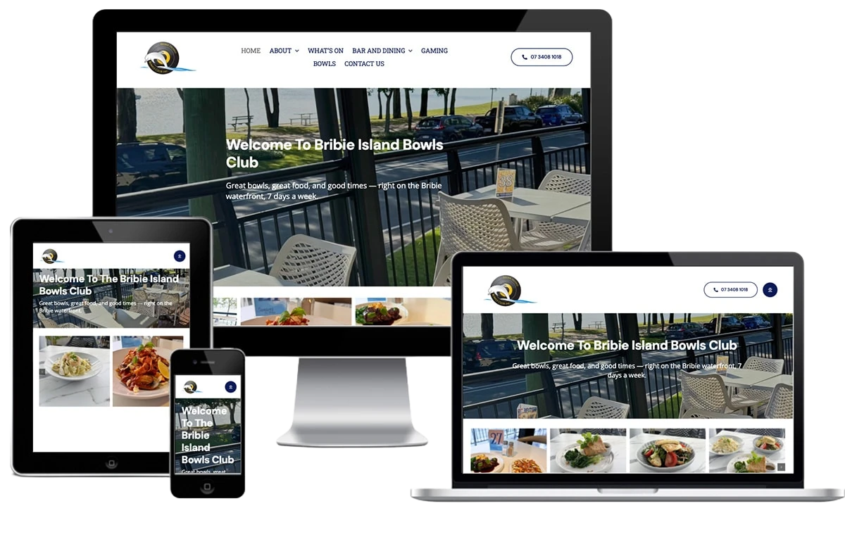

Responsive websites should feel clear on every screen
A website can look good on desktop and still lose enquiries if the mobile experience is poor.
We design responsive websites around how people actually use them. That means clear navigation, readable content, fast loading pages, simple forms, mobile usability and strong calls to action across every device.
See how this comes together in websites we have designed for real businesses.
Is Your Mobile Website Costing You Enquiries?
If your website is slow, hard to read or difficult to use on mobile, people will not wait around.
We design responsive websites that make it easier for visitors to understand your business, move through your pages and take action.
A better mobile experience can help turn more visits into calls, enquiries and customers.
Responsive Websites Built For Every Screen
A responsive website should feel clear and easy to use wherever someone finds you.
We design custom websites that keep the experience consistent across mobile, tablet and desktop, so visitors can read, navigate and take the next step without friction.
With over 1,500 websites delivered, we bring practical experience to every responsive website project.
Let’s create something that works on every device.
 Rated
Rated Our Responsive Web Design Process
We follow a clear process that keeps your website aligned with your users, goals, content and device needs.
Designed For How People Use Websites Now
Responsive web design needs to support more than screen size. It should help people stay on your site, understand your content and take action without friction.
That means planning mobile usability, page speed, navigation, content order, forms, buttons and calls to action around real user behaviour.
A well-built responsive website can improve engagement, reduce frustration and support stronger SEO performance by giving visitors a better experience across every device.
It also helps your website stay consistent as people move between phones, tablets, laptops and desktops during the buying journey.
What Makes Responsive Web Design Different From A Standard Website?
A standard website is often designed for one screen size and adjusted afterwards.
Responsive web design is built from the ground up to work across every device, so navigation, images and calls to action all adapt properly rather than just shrinking.
For a Brisbane business, that means mobile website design isn’t a separate add-on, it’s the foundation the whole site is built on. We can walk you through what that looks like for your specific site.
Why Choose Scorched Media?
 A responsive website works best when the right people can find it. We can support your website with
 Common questions about responsive web design
It All Starts With a conversation!
Need a website that works across every device and turns mobile visitors into enquiries?
Start a conversation with Scorched Media about your goals, users and current website.
We will help shape a responsive web design plan around how people need to read, trust and take action.


